Exhibit 8 - Week 10 - Element of Art
-
Pen Tool Usage
Thoughts about the design....
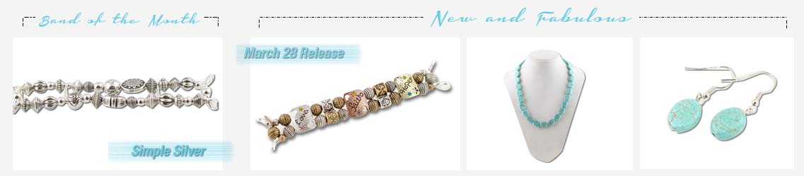
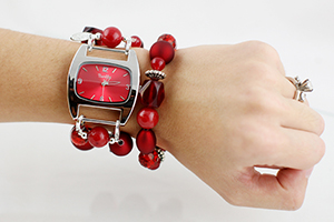
So this is a part of an image that is on the website currently being developed. It is currently being hosted at a development area at www.bumblesdesign.com/index.aspx and will eventually be moved to the actual hosting location. This image is located at the bottom of the main page. The purpose is to display the current band of the month and new product being released (about every three weeks). This image will be updated the Monday before the release.
Currently our photographs are taken on a background that displays as somewhat gray color and each time the photos are taken, the background will vary in the gray background and shadows are always present. Using the pen tool, the gray background is removed and the image placed on a white background so that the product will stand out.
The design of this image was based on the layout of the website I am currently working on with a client.
Contrast: Getting a strong white background on the product so the product would stand out and be noticed.
Repetition: The color, font, the painted line and the dashed bar are repeated throughout all pages.
Alignment: The whole page is aligned with one large, then three boxes, then 4 box alignments down the page. This image represents the 4 box alignment.
Proximity: The band is separated from the new product release by using the dashed line.
Colors: The colors are based on the branding scheme for this client.
Type: the fonts are based on the branding scheme for this client.
Credits:
Images taken by Amber Togisala
Fonts: Housegrind and Helvetica Neue
Exhibit 8 - Week 10 - Element of Art
-
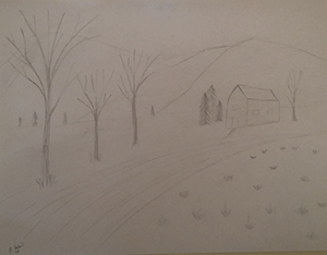
My 5th Grade Art Project 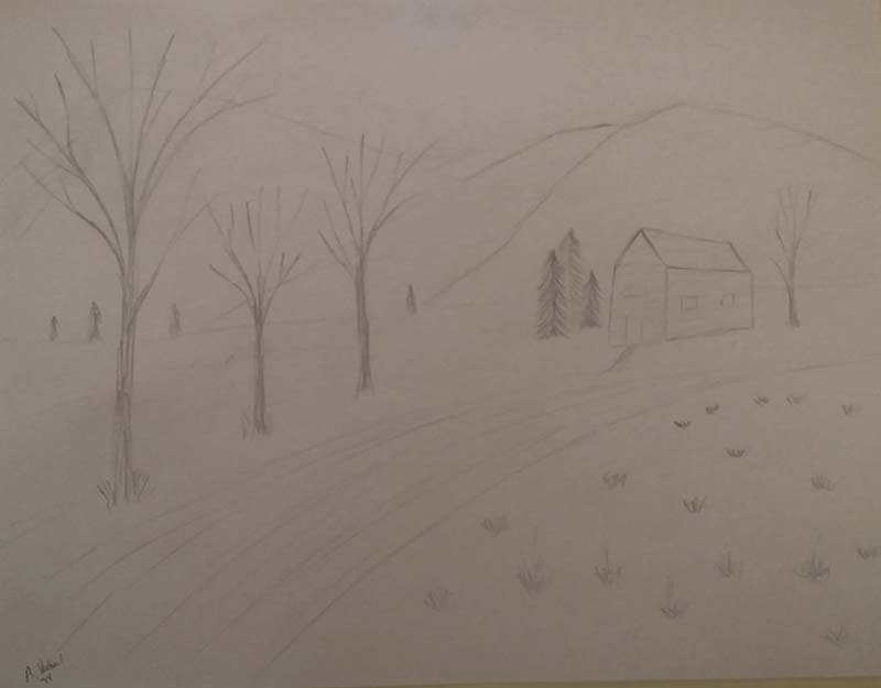
My 5th Grade Art Project -
My Drawing of a Tree using line element 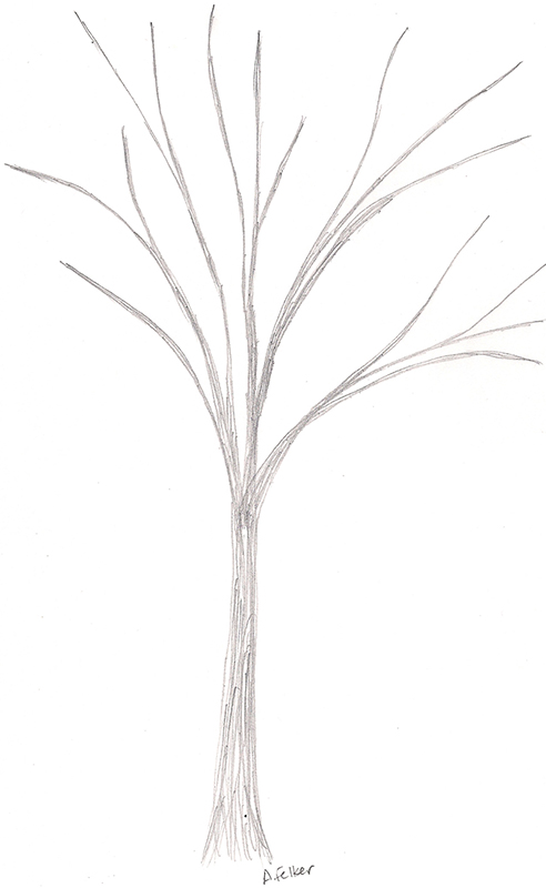
My Drawing of a Tree using line element
Thoughts about the design....
My fifth grade teacher was one of those teachers that you never forget. He made learning fun. I still remember things he taught. He loved the Hobbit and built the Hobbit reading hut in our room. When I need to spell certain words, I still remember how he taught us how to spell words. He also loved art and I just realized that he had been teaching me elements of design without me knowing. I remember him teaching us about perspective and making things look smaller away. The other was how to draw trees (element of lines). He had taught us several different things and then gave us a project to draw something with different elements. Until this lesson, I never really had grasped what he had been teaching us.
I went through my boxes and found my project that I had drawn. I tried to scan it, but it wouldn’t come through very well so I took a picture of it. I then drew another tree using the line element using the same technique that he had taught me many years ago. The line not only was used to start the tree, but it was used continually to create the thickness of the tree and limbs. I was surprised at how close it looked like the original one I did in 1974. Amazing how it has taken me almost 40 years to have a light bulb come on.
Exhibit 8 - Week 10 - Camera Raw
-
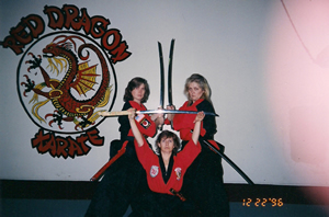
The Women Black Belts 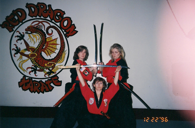
The Women Black Belts -
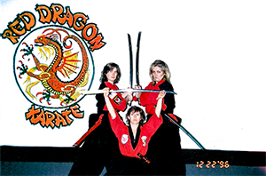
The Women Black Belts 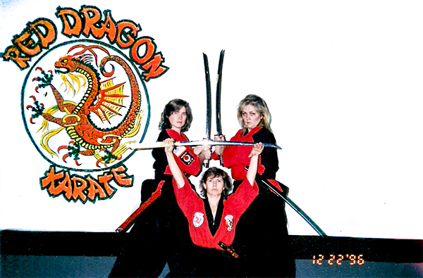
The Women Black Belts
Thoughts about the design....
For this, I used a photograph from 1992 that was taken by the woman black belts at the studio. This is me, Lori, and Cindy. This photograph was taken before digital cameras were available. This image was somehow overexposed on the right. Not sure if I actually used my flash or not. Also, the wall had a big hole to the right side of the wall. I brought this into camera raw and started by adjusting the settings to find the look I liked. I then used the gradient tool to adjust the upper left corner to lighten it more. I then used the brush tool to lighten the background and the red on the background. I then used the spot healing to clean-up the carpet on the bottom right corner. I also darkened the black and use the brush to darken up most of the black.
Exhibit 8 - Week 10 - Channels and Masks
-
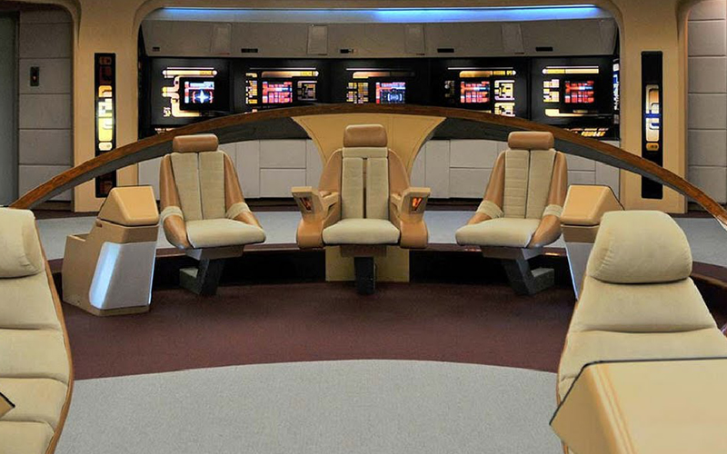
Save the Bridge - image from www.newstarship.com 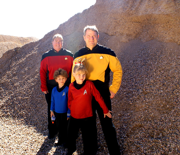
Save the Bridge - Original Family Photo -

Save the Bridge 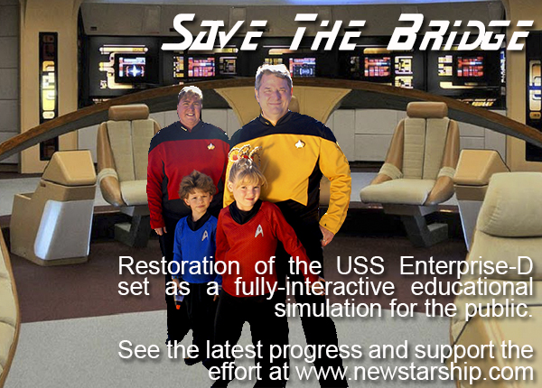
Save the Bridge
Thoughts about the design....
So as an avid Trekkie, I was hoping to be able to actually find a star trek bridge that we could take the pictures on but I couldn’t find one so a gravel pit was used to represent the away mission. I so wanted our family pictures to work out but the photographer overexposed all of them. As I am a follower of all Star Trek activities, knowing they are rebuilding the set of the actually bridge is pretty exciting. So I decided to make an advertisement for the New Star Ship organization and I used one of their images of the Star Trek Bridge located on their site so I could add my family photograph.
I was able to lighten the image using camera raw but had a hard time fixing the light on the head so it looks like there is a sunroof open on the bridge (ha ha). I then used the technique shown in the video (motorcycle). I actually spent several hours doing this technique over and over so I could understand and try to get the best look. I also used the refine edge. Once I got this done and posted to my e-portfolio, I noticed some more edges that could use some work. It was then that I realized that when I resized my image for the web posting, I save it in the 300 pixel size so I couldn’t go back and edit it again. I will be doing this again to see if I can better this and hopefully get it resubmitted before class time. I was just excited that I finally was getting the whole masking and channel concepts – ta da….
Contrast – I think the whole concept of how Star Trek used the colors of the uniforms against the color of the bridge worked well in the contrast.
Repetition – Well, the uniforms. Everyone is wearing one of the three colors of the uniform but all are in a uniform. The bridge also contains lots of repetition in the chairs and the screen displays.
Alignment – I decided to put my family somewhat in the middle and slightly off centered. The words were the right because they looked better than on the left.
Proximity – Putting the family right in the middle of the bridge – making the “we were here” statement stand out. The text is above and right below.
Color - The standard colors of the uniforms drive the colors. I made the text white so it was visible.
Typography – well, the Star Trek font must be used here.--also known as the Star Next. I also used the Arial font for the quantity text. I used some blending options on the text so that it would stand out more.
Credits:
Image from newstarship.com, words were rewritten based on text from website. Fonts: Star Next, Arial.
Exhibit 7 - Week 9
-
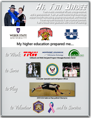
GEAR UP Project 
GEAR UP Project
Thoughts about the design....
My background is mostly in software design and programming. I love to learn and experience lots of things. I have two bachelors and will have my second masters in May. My goal is to eventually have my doctorate. My design was based on those experience that were opened up because of the education I received. Hard work and trying is what improves our brain and makes us smart, education is the door that opens up all the possibilities to use that learned brain power.
Contrast - I chose to use a simple darker background and white box to focus on the education as this is what we are trying to highlight, the higher education.
Repetition - used consistent type and the drop shadow on the text.
Alignment - I chose to align to the right and left sides with some centering. The company logos down to the racquetball picture into a v-shaped alignment.
Proximity - The elements of my life are grouped together starting with the education.
Color - My favorite color is green. I wanted to use green in this but because I had several images with different colors I chose to go with a gray color that was more neutral so it would not detract.
Typography - Because this is about me and I am a Trekkie, I used the Star Trek font. I also paired it with a cursive font to give it some elegance. For the verbiage text I used a straight font to allow for readability.
Credits
Image Credit: Weber State Logo, University of Maryland Logo, Utah State Logo, Utah EMT Patch, Navy Logo (official seal), Thyroid Cancer Ribbon (choosehope.com). Racquetball picture taken by Richard Felker. Navy pictures taken with my camera by fellow sailor. Photo with husband taken by Aubree Heslop Photography.Fonts: Ebrima, Prestina, and Star Next.
Exhibit 6a - Week 8
-

Family Star Trek with Shadows 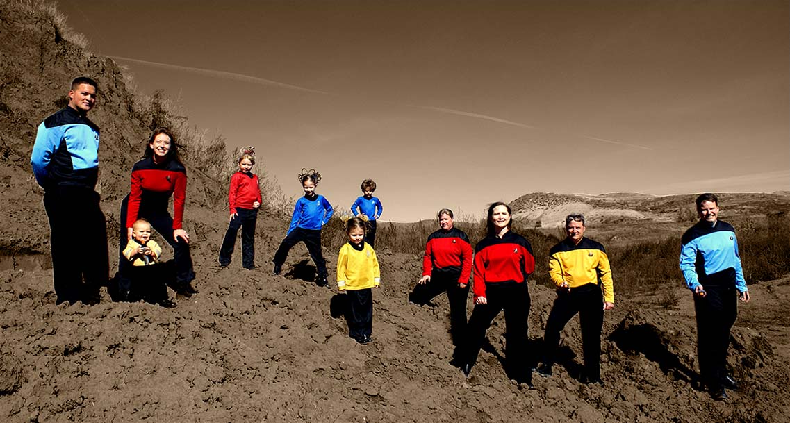
Family Star Trek with Shadows -
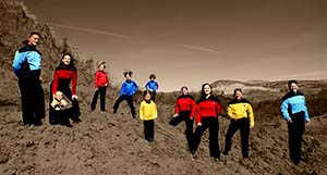
Family Star Trek - No Shadows 
Family Star Trek - No Shadows
Thoughts about the design....
In 2009, my step-daughter talked me into using her friend for our family photographs. She is an amateur photograph and when she took the photographs, they seemed to have been overexposed. Honestly, I was not too happy and I tried my best to use what I could. After watching the b/w videos, I thought maybe I could salvage them into black and white versions and found it helped dramatically.
In the course material, I was drawn to the image with the girl holding the frame and the color inside. I decided I would see about leaving some color in my photograph just for fun. I decided that the contrast would be the colors in Star Trek uniforms as this represent their role. After I selected the people, inversed the section, then applied a black/white filter, I then adjusted the levels and applied a tint. I wanted more of a red color but didn’t like it so I adjusted to more of an orange tint.
After I did this, I then used the content aware tool to hide the truck in the right middle of the screen, and also remove the shadows of the people. With the shadows removed, it appears as if they are superimposed on the image so not sure if I like it with or without the shadows. I present both.
Credits
Image Credit: Bonne's Friend Photography (Don't remember her name)
Exhibit 6b - Week 8
Credits
Image: rgbStock.com, khoirulpage.blogspot.comFonts: TimeBurner, Popcorn Sketch
-

Family Star Trek with Shadows 
Family Star Trek with Shadows
Exhibit 5 - Week 5
Credits
Fonts: - Colored Crayons, Drawing GuidesImage Credit: EEJCEHS Logo, www.theeyec.org, www.oswaldcompany.com
-

Education Flyer 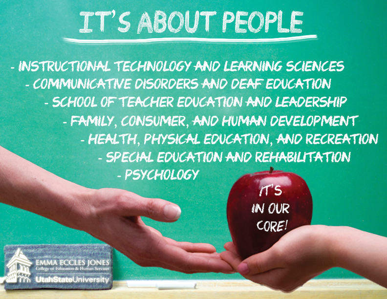
Education Flyer
Exhibit 4 - Week 4
Credits
I took the background fence from an image located on got3d.com image. The grunge paper was taken from....well I don't remember, I looked at so many not sure which one....but it is not mine. The push pin was taken and modified from fiveminutemarking.com. The fonts used was Go 2 Old Western and Kids First Print. The family photos were taken by Aubree Heslop Photography.
-
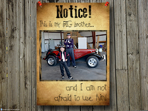
Anti-Bully Poster Brother 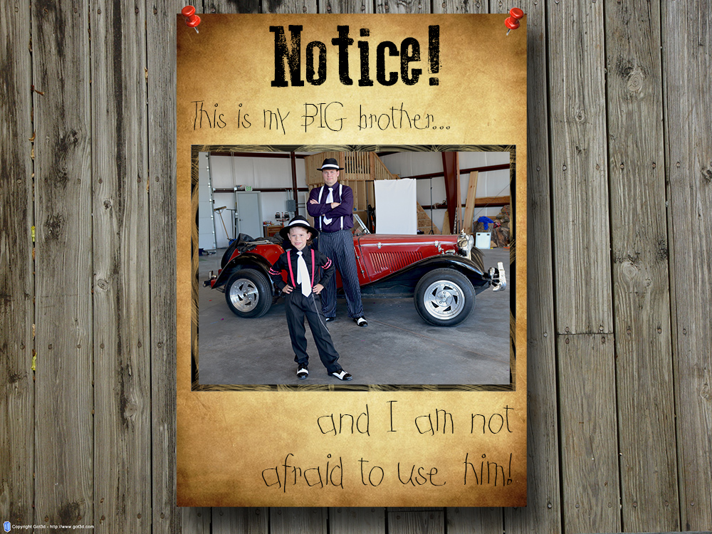
Anti-Bully Poster Brother -
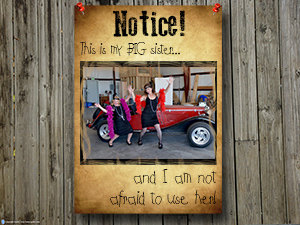
Anti-Bully Poster Sister 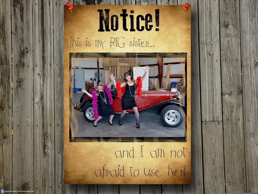
Anti-Bully Poster Sister
Exhibit 3 - Week 3
The original photo was taken by Togisala Photography for Bumbles. She takes the photographs and sends the raw image that is used in the shopping cart photos. Some photos are turned into the slide show presentation on the company main page. The following was designed to the size used on this slide show.
-
Raw Image 
Three Kids Before -
With Some Flare 
Three Kids After
Exhibit 2 - Week 2
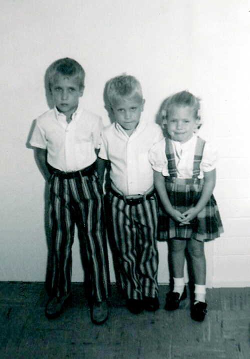
The photo was taken around 1970. I am with my two older brothers, Robert and Kirk.
-
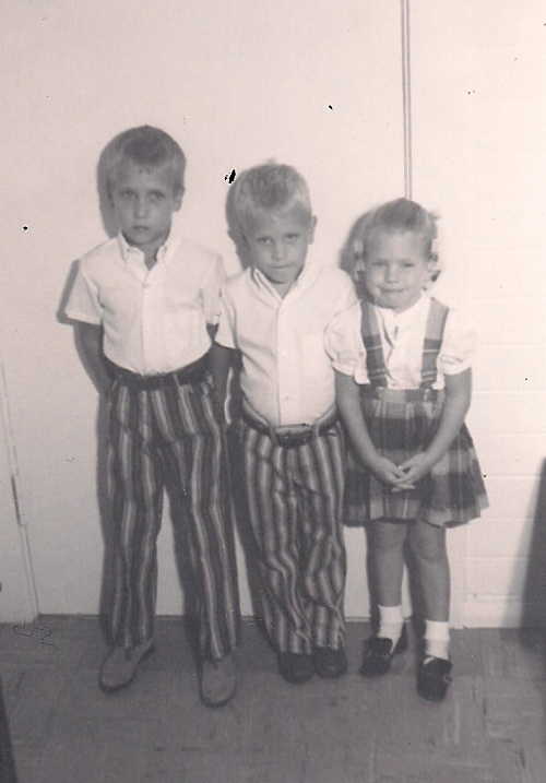
Three Kids Before
Three Kids Before -
Three Kids After
Three Kids After
Exhibit 1 - Week 1
The photo was taken by Aubree Heslop Photography. The photos were taken in our hanger at the Ogden Airport. Our family takes our yearly photos very seriously and it is a big event.
-

Family Photo Before 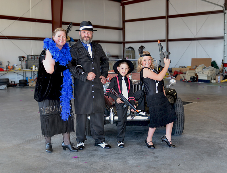
Family Photo Before -
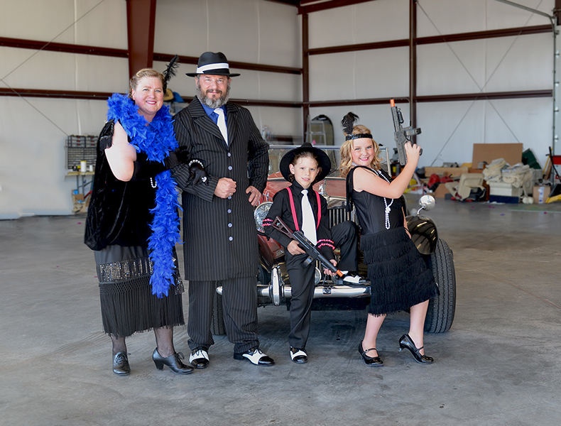
Family Photo After
Family Photo After